“Clear structure, compelling messages”
At the beginning of 2019, BT innovation has launched its new corporate design, including a new company logo and color range, a redesigned website, and all its marketing collateral. BFT editorial staff attended the launch event for this new, revitalized corporate presence at the BAU trade show in Munich. At the BT innovation booth, Anne-Maria Wende, Marketing Director, and Henrik Wärnke, Sales Director, explained these changes and the reasoning behind in more detail.
BFT International: BT innovation is starting into the year of 2019 with a new corporate design. Why did you opt for this relaunch?
Anne-Maria Wende: During the past few years, BT innovation has embarked on a path of significant growth and expansion. And a truly professional business needs to have a modern corporate design in place that appeals to its customers and prospects. This is where we had to catch up with latest developments.
Initially, we analyzed the environment of our brand. For this purpose, we had a closer look at our competitors, carried out a customer survey, and held in-house workshops. These elements provided the basis from which we derived a strategy for communicating the attributes and benefits of our BT innovation brand.
We wanted to strengthen our profile to make the brand experience even more tangible, strong and unique for both our customers and our employees.
Our company name, BT innovation, communicates our own ambition to develop highly innovative products that accelerate processes. Our customers benefit from these attributes. In our new claim, we translated this advantage into a clear proposition communicated to our customers: “Für schnelleres Bauen” („Speeding up construction“). Let me add that not many people will probably know that BT stands for Bauen und Technik, or Building Technology.
BFT International: Which specific changes to your corporate design did you implement?
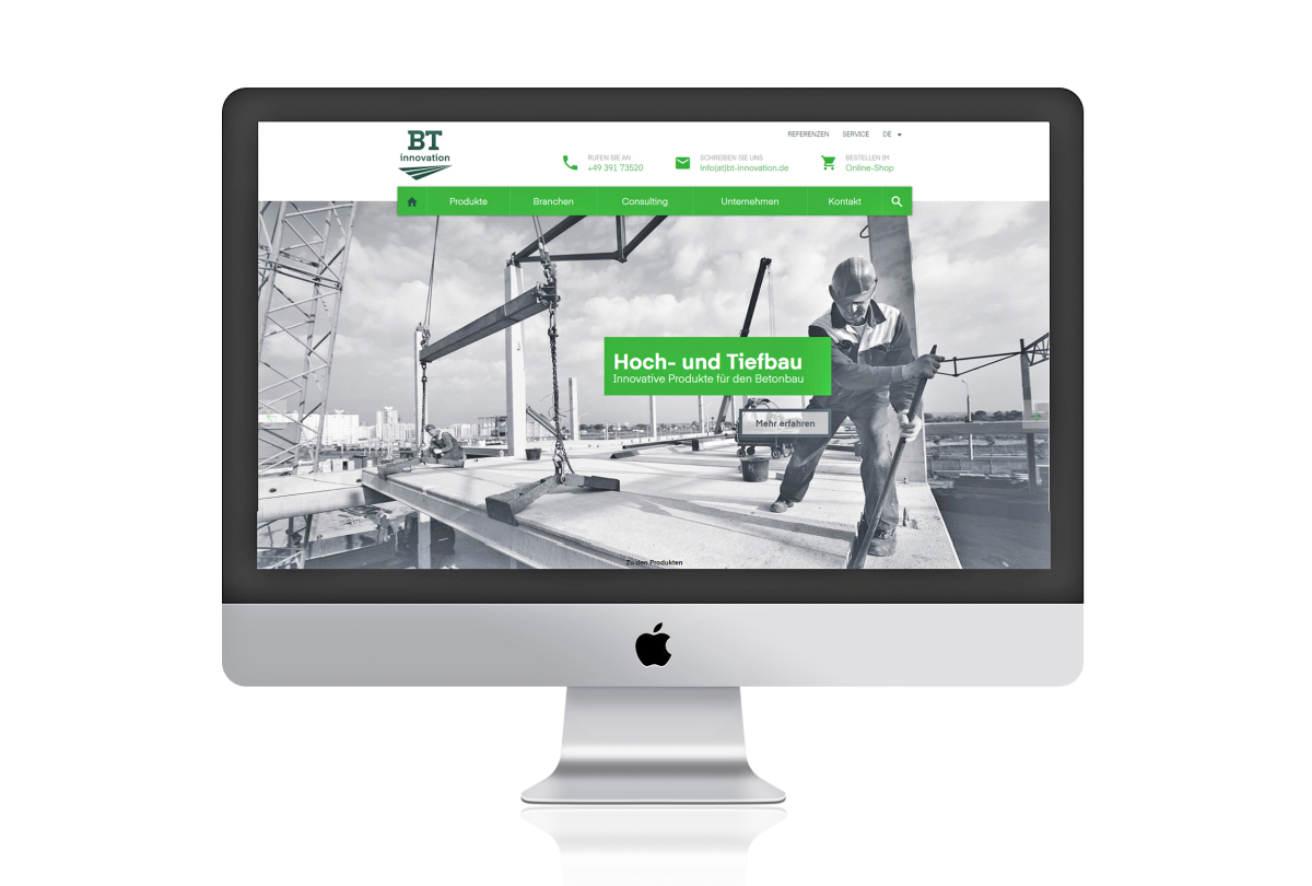
Anne-Maria Wende: We revamped the entire look and feel of our brand, including our logo, fonts and color range, as well as all stationery and office supplies. As a matter of course, this relaunch also included our product catalogs and all other sales and marketing collateral. Add to this our new website and trade show design, and you’ve got the complete picture.
BFT International: What are the effects to be achieved by the individual changes?
Henrik Wärnke: It goes without saying that, on the market, we want to be perceived even more clearly as an innovative, high-performance company, with the aim to continue on our growth path. We want to demonstrate to what BT products and services have always stood for whilst also stressing their key benefits.
Yet there is even more to it because our new corporate design will also provide the potential to unlock the pride and dedication of our people, so our new presence and the associated changes should definitely also highlight the attractiveness of BT innovation as an employer.
Anne-Maria Wende: To strengthen the essence of our brand, we set out to define our core competencies more clearly, which is important because this is the only way to attract and retain customers and employees in the long term. Customers need to understand what a brand stands for, which means for us to establish a clear structure and convey compelling messages.
We provide our customers with easy-to-read, well-structured content and ways and means to communicate – both in our catalogs and on our website –, and we are also increasingly integrating clearly legible infographics.
Over the coming months, we will also be improving our webshop to enable our customers to order many of our products online. Providing superior customer service should be part and parcel of a modern brand profile, after all.
BFT International: What will change more specifically on the BT innovation website?
Henrik Wärnke: First of all, we’ve implemented our new corporate design. The aim of presenting our business and product range in a clearly structured way was very important to us. Our customers include both precast producers and building and civil engineering contractors, which requires our website to be easy to use and quick to navigate. First-hand information about BT products is now readily available for our customers and prospects.
Yet we also wanted to provide more in-depth information about our products, as well as ways and means to approach and contact us directly. We’ve already seen a marked increase in the number of enquiries after launching our new website. We are really pleased about this response, which also confirms our way of implementing things.
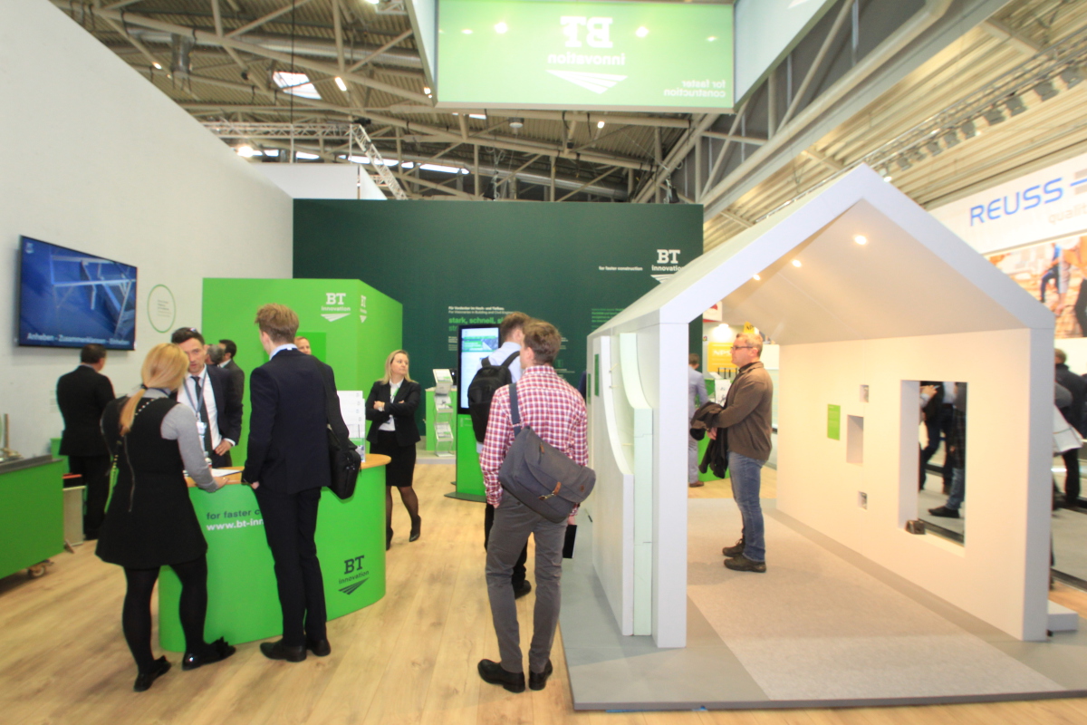
BFT International: At the BAU 2019, you are showcasing your new corporate design for the first time at your booth. What are the key messages you want to convey?
Anne-Maria Wende: Our new booth is set to become even more interactive. We’ve installed a walk-in model house to display our products for building construction and civil engineering in a hands-on setting.
Visitors can use interactive screens to be guided through our product portfolio.
We’ve also set aside a separate area for prospects from the precast industry to demonstrate our magnet and formwork technologies. Also, we invite all “cinema lovers” fond of cutting-edge equipment to have a closer look at the latest addition to our range, the butterfly formwork system, in a high-resolution 3D animated video to be shown on a full-HD screen.
Interview: Christian Jahn, M. A.